
How to Reference a Brand's Whole Visual System, Not Just Its Gradient
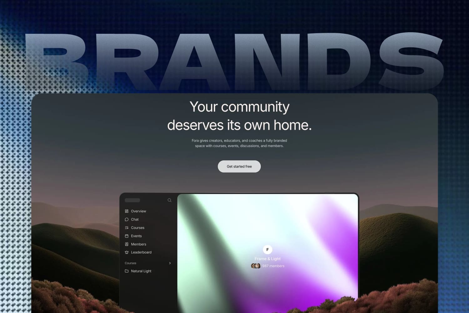
When you’re designing with gradients, it’s easy to fall for a color combination that looks great on its own and drop it into a product where it doesn’t really belong.
But the brand feel of an interface is rarely decided by the gradient alone. Contrast between background and text, type hierarchy, spacing, corner radius, surface treatments, and where each color is allowed to appear all change how the same palette reads: restrained and considered, lively and playful, or just a disjointed mess.
While making gradient assets for GradientsHub and looking for direction in the Mesh Gradient Generator, I often start from color and gradients. And it keeps reinforcing the same feeling: a gradient is only one piece of a visual language. What’s actually worth studying is how it relates to the rest of the interface’s rules.
Gradients have become a staple of modern web design
Gradients are now a common visual language across modern web design, especially on sites for AI products, design tools, and developer tools. Sometimes a gradient builds a sense of space and speed across the hero; sometimes it’s part of the brand identity itself; sometimes it’s just a local accent on a card, button, or product preview. What these sites share isn’t that they all use gradients. It’s that they all place gradients inside a clear brand context.
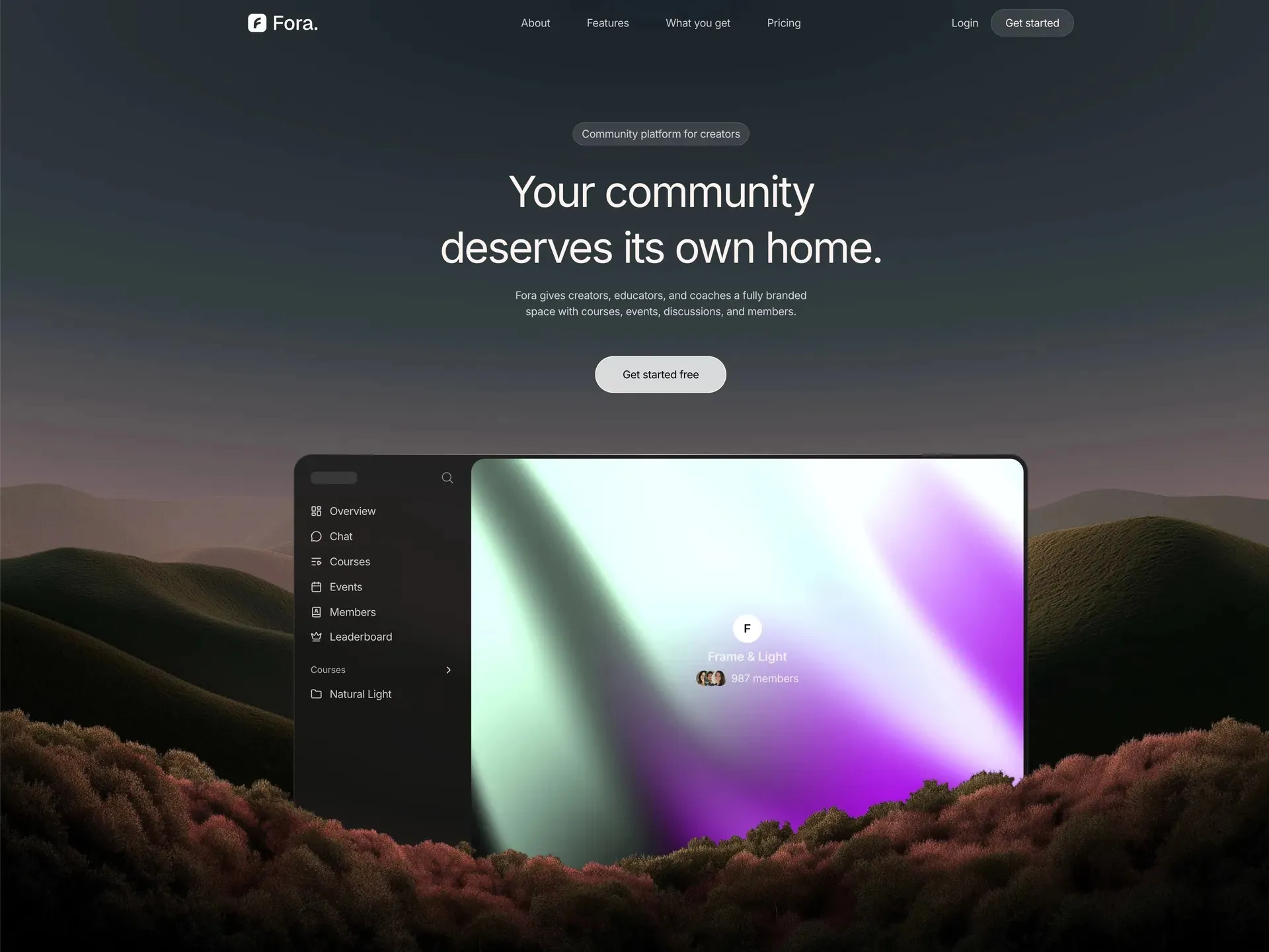
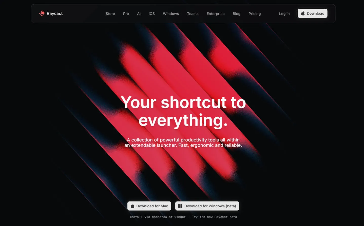
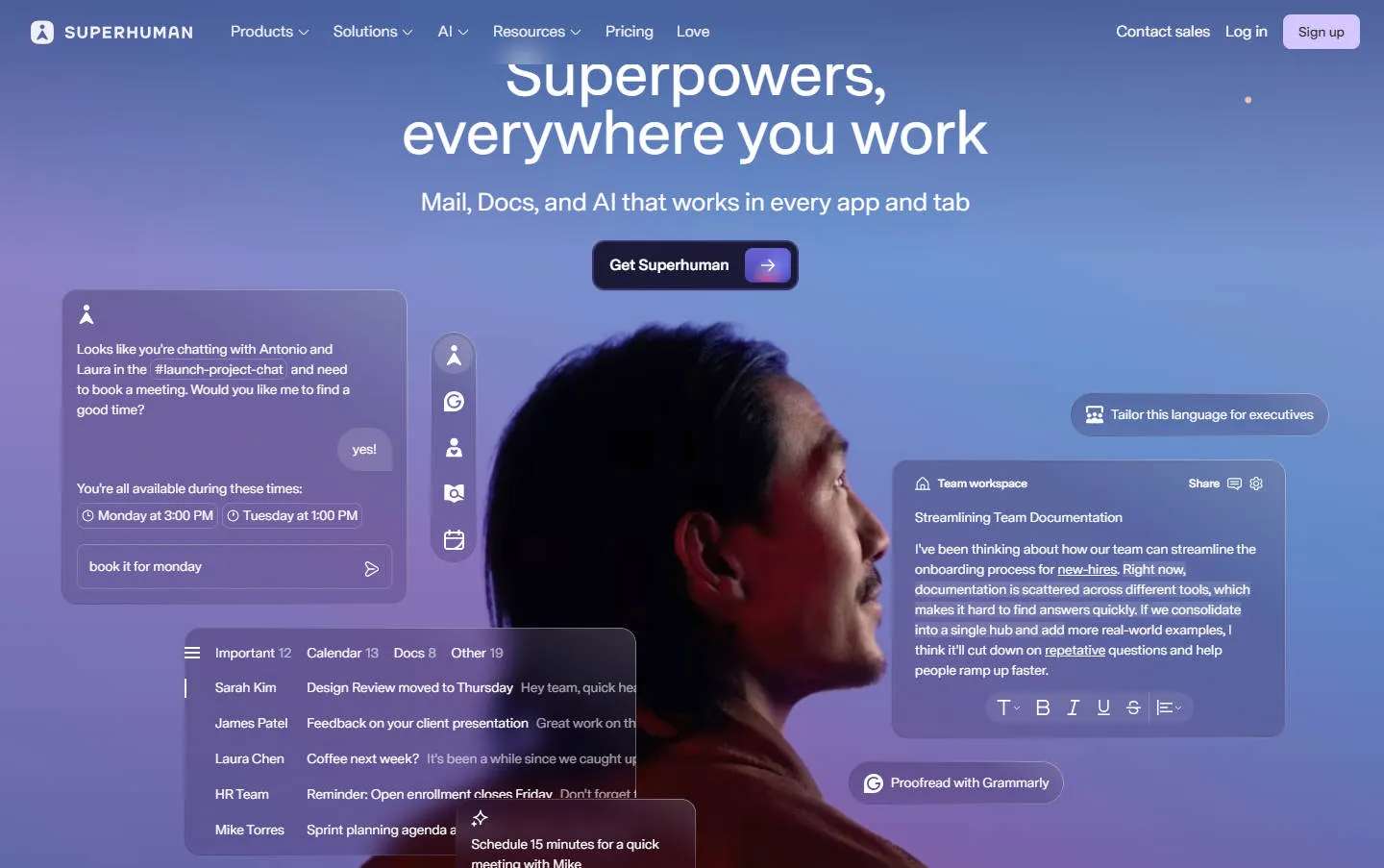
Precisely because gradients are so common and so visible, getting them right matters. My own habit is to start from the design spec: look at how a brand’s primary, secondary, and neutral colors form a color system, understand how they relate, and then pick gradient colors from within that system. Randomly trying a few colors or picking a pair on feel can look fine in isolation, but once it sits in the interface it often clashes with everything else and feels ungrounded. A gradient built from the brand’s own color system naturally shares the same color logic as the rest of the page, so it sits more cleanly. To do that, you first need to see a brand’s complete color system and design rules, and a single isolated gradient image isn’t enough to start from.
To see that kind of complete system, brands-design-md is the brand design reference I open most often. It currently collects 68 brand directories, including Airbnb, Apple, Figma, Stripe, Vercel, Notion, Claude, and Duolingo. Each brand is no longer just a URL or a screenshot. It’s organized into a set of files you can browse, read, and hand off to AI tools or frontend developers to keep building on.
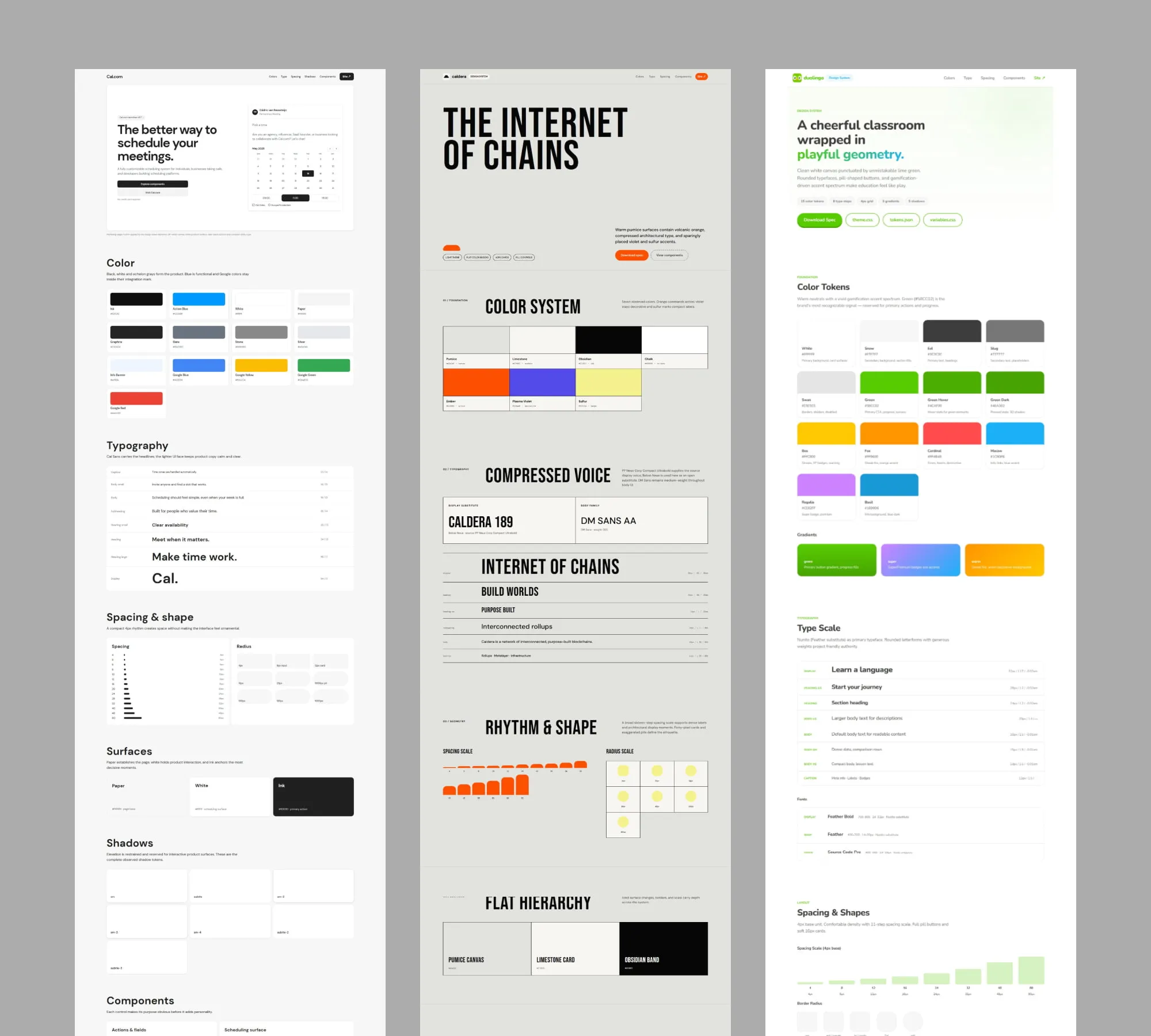
Screenshots show the style, but they don’t explain the rules
We usually hunt for brand reference by bookmarking sites, saving screenshots, or browsing design inspiration. That’s great for first impressions: you can quickly tell whether a site leans bright or dark, whether it uses highly saturated colors or low-contrast ones, and whether the page feels more like a product UI or an editorial layout.
But screenshots struggle with the next round of questions. Why does this brand use this particular palette? Should gradients stay in the hero, or can they appear on cards and buttons too? How large is the hierarchy gap between headings and body? What’s the pattern behind the card radius, shadows, and whitespace? If you want to carry this feeling into a new page, what exactly should you reference?
A design doc can write down a lot of rules, but it isn’t always easy to skim. Especially in AI-assisted design and Vibe Coding workflows, saying “reference Notion” or “make it look like Duolingo” just isn’t specific enough, for humans or for AI.
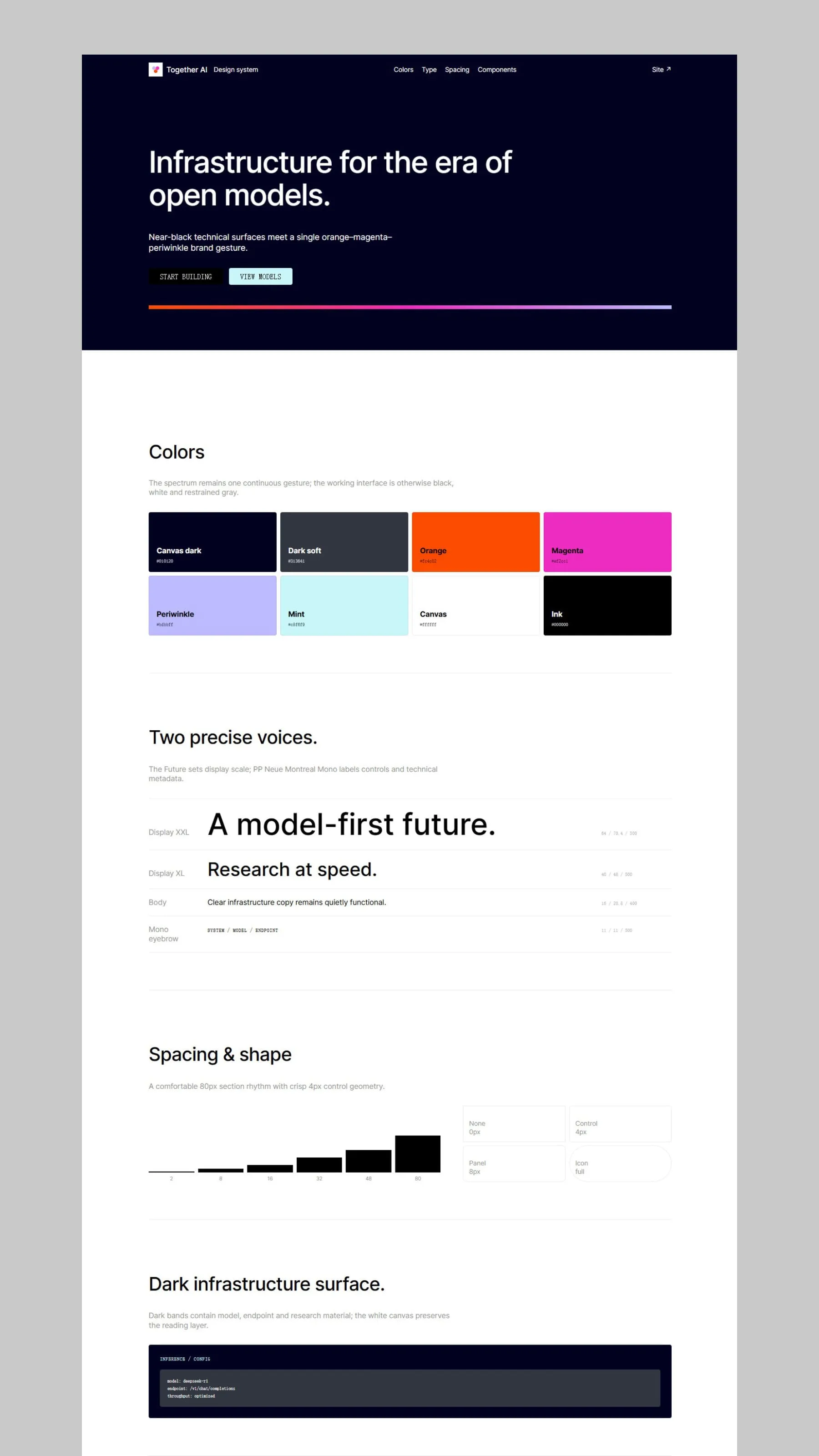
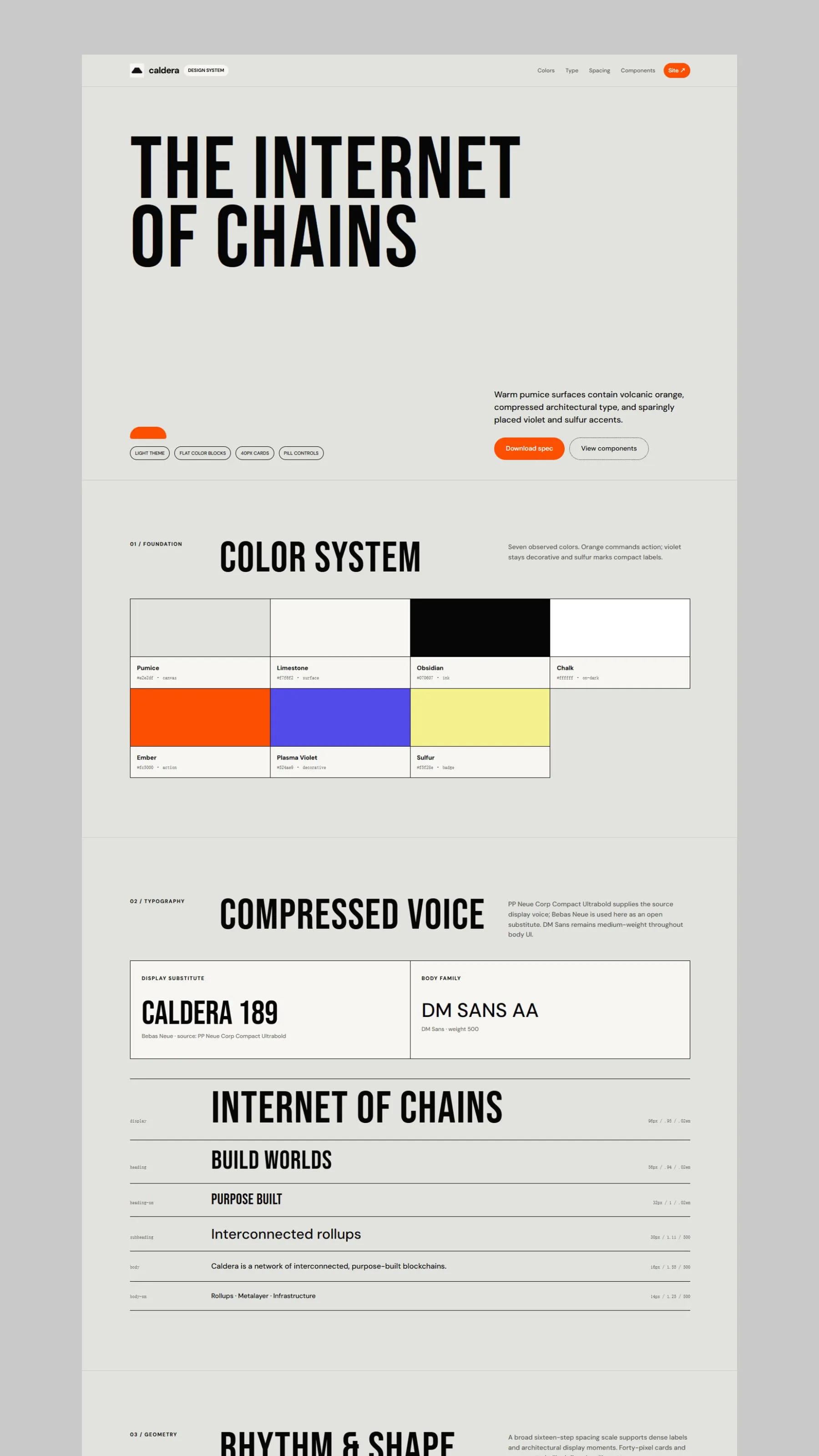
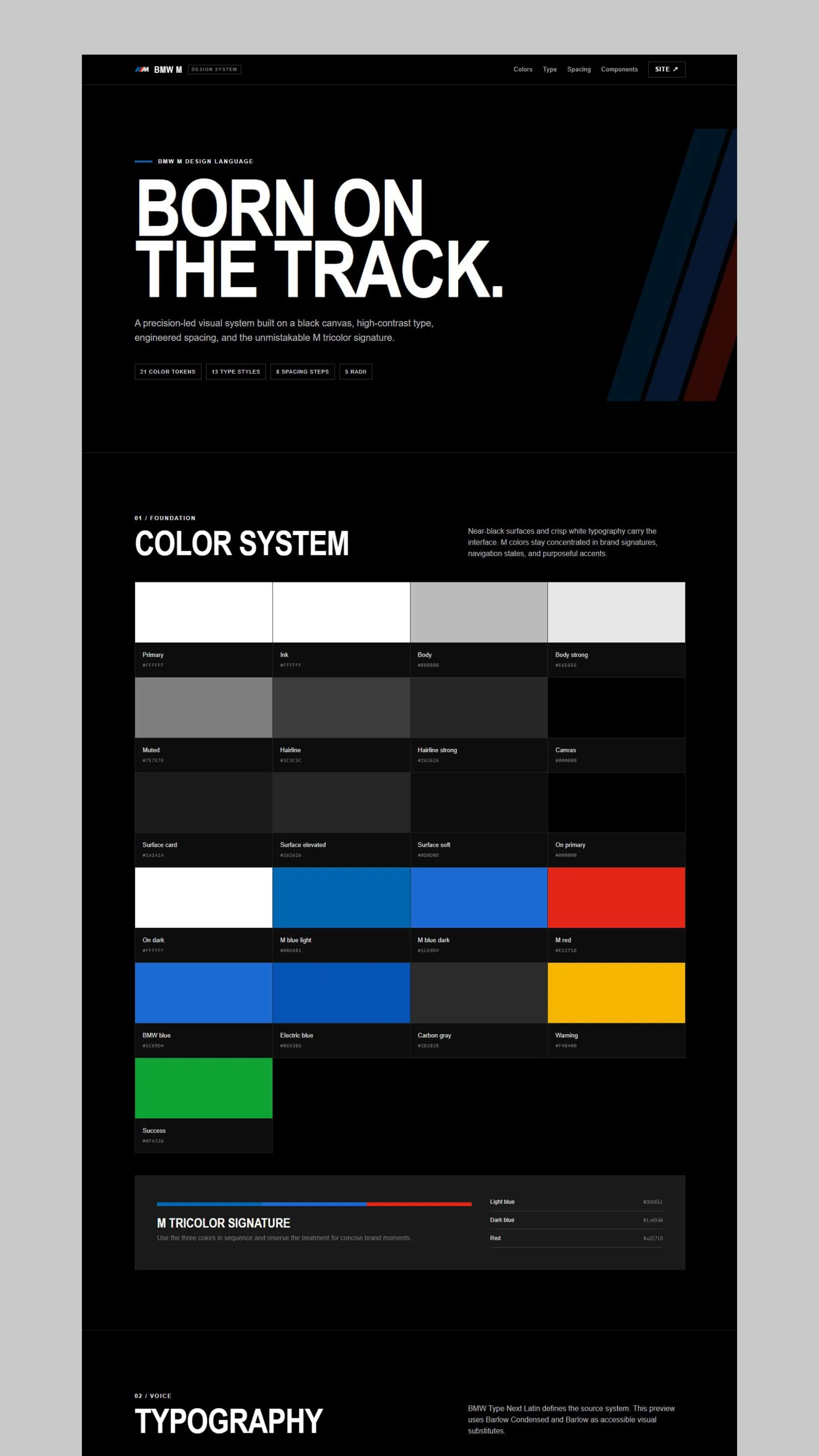
What brands-design-md tries to fill in is exactly the layer between screenshots and rules. It pulls a brand’s visual observations, colors, type, spacing, radius, components, and page rhythm into a single directory, so you can look at the page first to build an impression, read the rules to understand the reasoning, and then move into implementation from structured files.
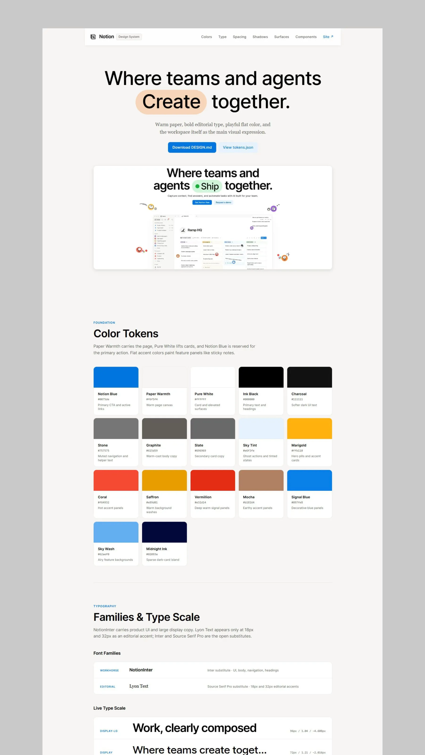
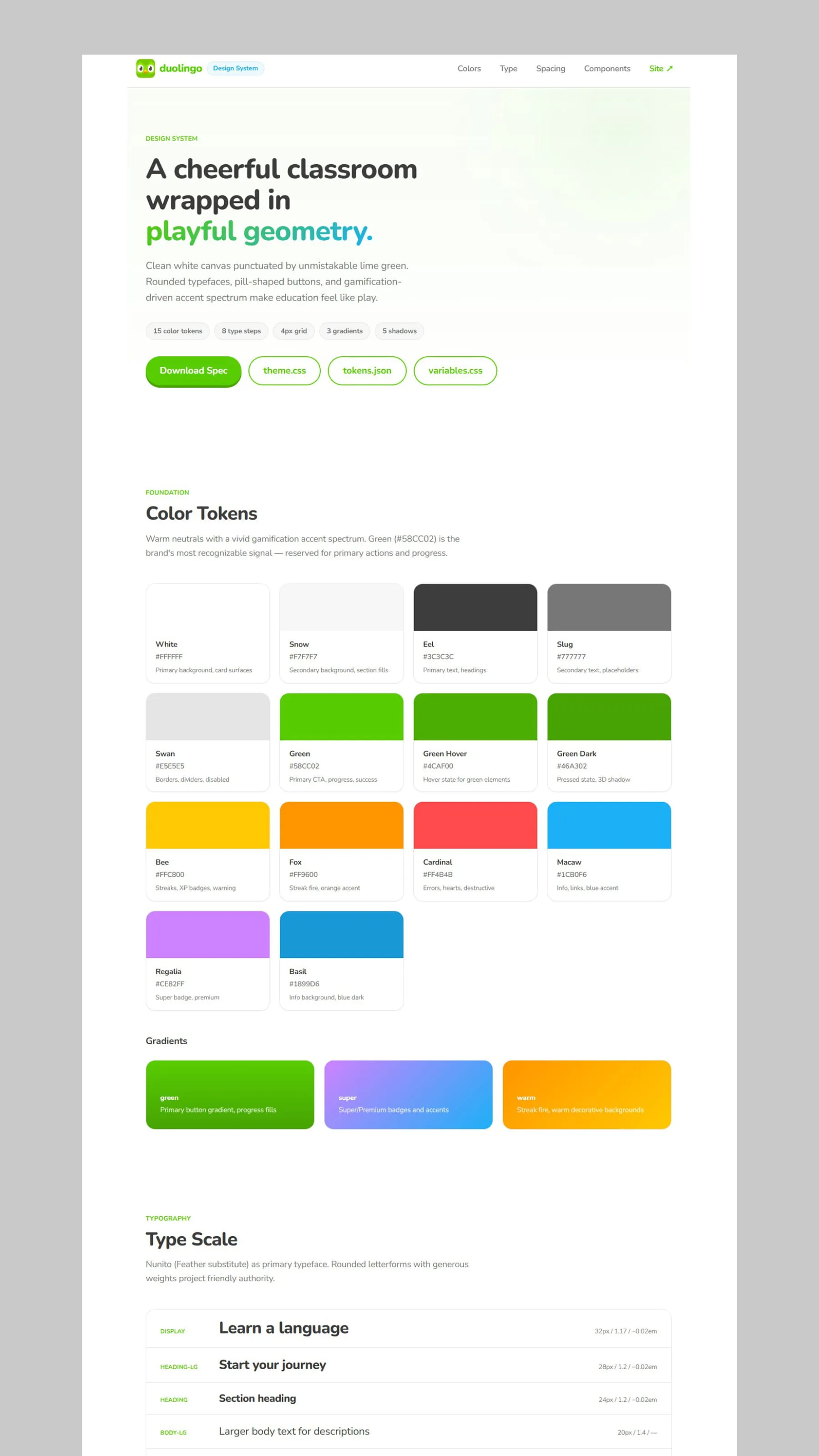
What’s inside a brand package
Every brand directory follows the same fixed structure. Using brands/duolingo/ as an example, a standard brand package contains these 7 files:
brands/
└── duolingo/
    ├── preview.html
    ├── DESIGN.md
    ├── cover_duolingo_com.webp
    ├── favicon.ico
    ├── tokens.json
    ├── variables.css
    └── theme.css
preview.html is a browser preview built to match the brand’s visual language. It brings the colors, type, spacing, radius, surfaces, and component treatments together into a single viewable page, so you can see what the rules look like once they’re combined.
DESIGN.md is the design context document. It records the brand’s visual observations, base tokens, type hierarchy, layout suggestions, component descriptions, and usage boundaries. Instead of a vague style description, it breaks “what it looks like” down into “how to keep building in this direction.”
cover_duolingo_com.webp is a screenshot of the brand’s official site, used to quickly recognize the original visual identity. It serves a different purpose from preview.html: the cover records where the reference came from, while the preview reorganizes the observed rules into a browsable reference page.
favicon.ico identifies the brand source. tokens.json stores the structured colors, type, spacing, radius, shadows, and layout. variables.css organizes these into CSS custom properties. And theme.css can serve as a reference for Tailwind CSS v4 theme variables.
Split this way, a single brand package gives you a visual entry point, a written explanation, design tokens, and a starting point for implementation all at once. It’s not just to make the directory look complete. It’s so the reference material can keep flowing into the next step.
From a gradient palette into the full visual system
When we only look at a gradient image, we tend to focus on the color combination and the lighting. But inside a real interface, whether a gradient holds up depends on its relationship with the other visual elements around it.
For example, the same highly saturated mesh gradient can feel like a tech-driven product atmosphere when spread across a large dark background, but on a white page with rounded type and generous whitespace it can shift into something lighter and more consumer-friendly. A gradient has no fixed brand meaning on its own. It depends on type, surfaces, contrast, components, and layout to finish the statement.
When you use brands-design-md, start by opening the cover and preview.html, and resist the urge to copy a color value right away. First observe the role color plays on the page: which colors are used for backgrounds, which only as accents; whether the page relies on strong light-dark contrast; whether the gradient is the visual lead or just supplies some atmosphere; and whether buttons, cards, and headings share the same rhythm.
Then read DESIGN.md to understand the design reasoning behind those choices. Finally, depending on your actual task, use tokens.json, variables.css, and theme.css as your implementation starting point. What you get this way isn’t an isolated gradient background. It’s a brand visual direction you can keep extending.
How to hand brand reference to AI
I mentioned earlier that a lot of these gradient-heavy product pages are now built with tools like Cursor, Claude, and Codex. But if you only hand AI a brand name, it usually generates a page from whatever it remembers about that brand from training data, and the result stays on the surface: the colors might be close, but the gradient lands in the wrong place, and the rhythm of the type, spacing, and components doesn’t line up.
A more reliable approach is to give it a brand directory as project context. Let the AI read DESIGN.md first, then hand it the matching tokens.json, variables.css, and theme.css together, so the visual observations and the implementation variables map onto each other.
For example, you could describe the task like this:
Reference the visual observations, type hierarchy, and component rules in brands/duolingo/DESIGN.md.
Use brands/duolingo/tokens.json, variables.css, and theme.css as the starting point for colors, type, spacing, and theme variables.
If the page needs a gradient, first decide what role it plays in this visual language. Don't apply gradients as default decoration across the whole page.
Build the page structure first, then implement it following these rules. Don't introduce decorative styles that aren't in the docs.
This is meaningfully different from just saying “reference Duolingo.” A brand name only gives a direction. Design context and token files are what turn that direction into constraints the AI can actually work with. These files aren’t there to make the AI copy the brand’s site verbatim, either. They help it understand the reference more accurately and extend it within sensible bounds for a new product task.
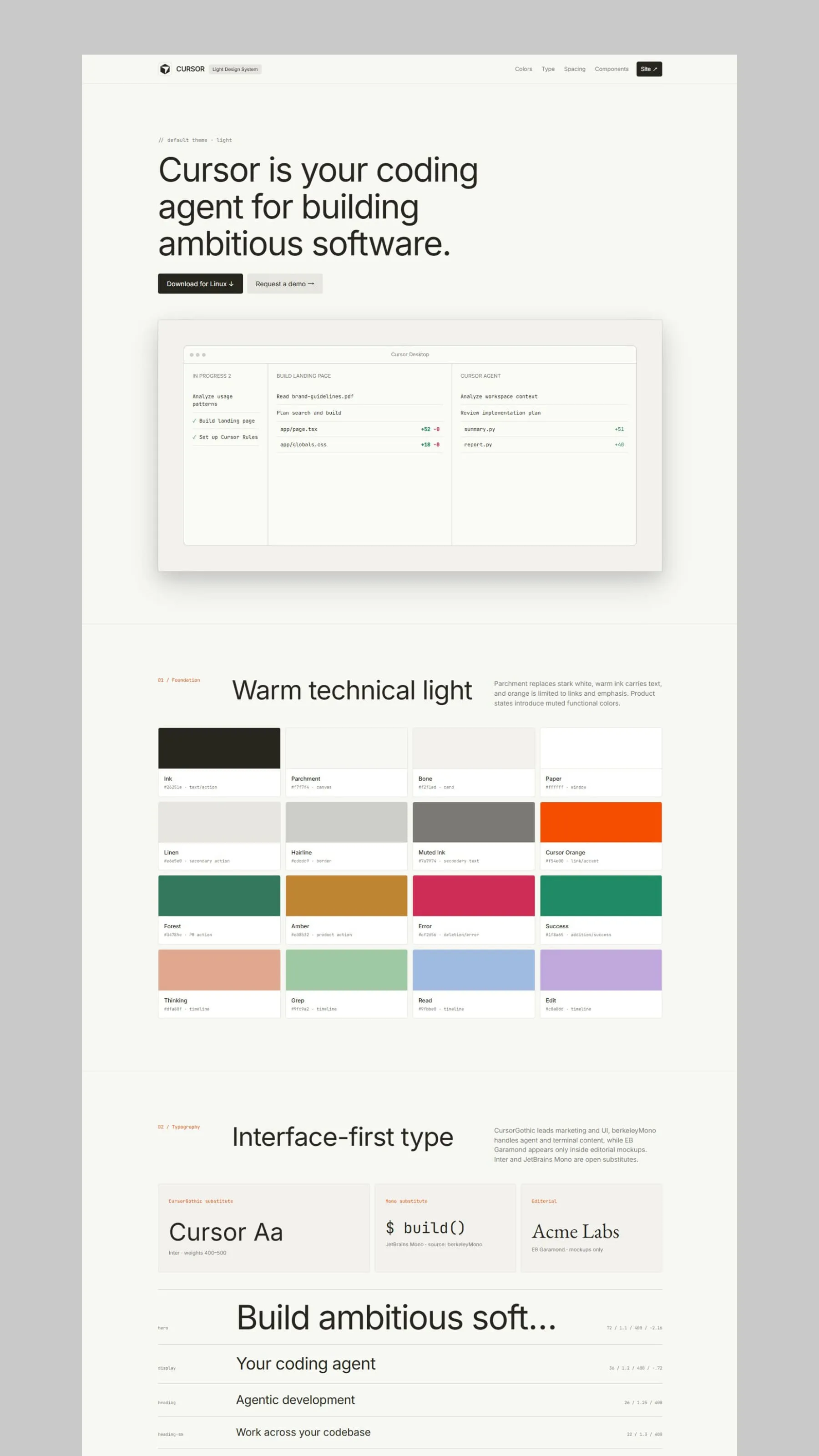
Where this reference fits
Whether you’re hunting gradient and color direction for a new product, assembling a theme you can use right away, or getting AI to ship a page that follows a brand’s rules, brands-design-md gives you the same starting point: a brand’s complete visual rules. The same directory serves three roles: a color-system reference when you’re working on gradients, a source of tokens and CSS variables when you’re building a theme, and readable context when you’re handing things off to AI. That cuts out a lot of the back-and-forth between reference, implementation, and shipping.
It’s a reference layer, not an official spec or component library
The design docs, preview pages, screenshots, and related files in brands-design-md are generated, organized, and proofread by the project’s author, with reference to the brands’ public websites and public design resources like getdesignmd and Refero Design. They’re meant for learning, research, and interface creation. They can’t replace a brand’s latest official design spec, and they don’t represent any authorization or partnership with the brands.
Some brand directories are reference versions put together from a brand’s public visual language. Brand sites keep changing, so the material here should be read as a design observation from a specific point in time. When you use it, check the current state of the official site yourself and make your own trade-offs based on your product’s goals.
The repo also doesn’t ship an installable React component package, and it doesn’t include brand-licensed commercial assets. What it provides is a layer of brand design context: a way to start from screenshots and names and keep going, to understand how color, gradients, type, layout, and components relate to each other.
If you’re looking for fresh gradient palettes, you can absolutely start from a single color or background. But if you want the final page to hold together as a stable visual style, you eventually need to step back and look at the whole design system. In my view, brands-design-md just makes that reference process a little clearer: humans look at the visuals, AI reads the rules, and when it’s time to build, you move in from the tokens and CSS files.
You can browse every brand directory in the GitHub repo.